NoBS Creative Agency

Year: 2026

A water brand built on trust, not waterfalls.

About the Client

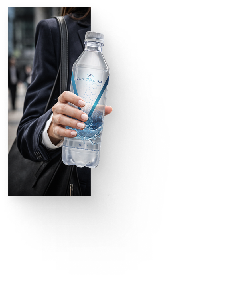
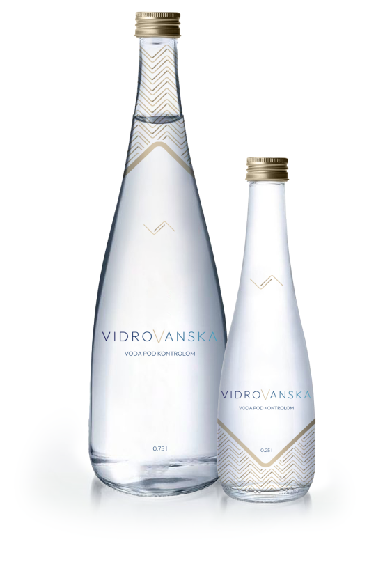
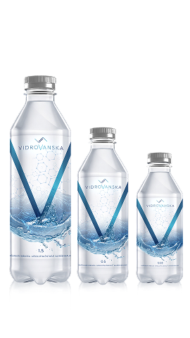
Vidrovanska Water is a new bottled water brand emerging from Montenegro, entering a saturated regional market full of mountains, “untouched nature,” and the same recycled nature-first messaging. But this brand didn’t come to compete on scenery. It came to own something no one else was talking about: control, hygiene, and trust. Not where the water comes from, but how it’s treated, protected, and delivered.

What We Do

Vidrovanska came to us with a mission: build a new bottled water brand from the ground up – name to packaging, strategy to storytelling. We said yes, rolled up our sleeves, and got to work.

Our full scope of work included:

We developed a complete market positioning strategy focused on one core truth: safety and controlled purity. In a market obsessed with “natural,” we created a brand that leads with precision.

Tone of voice, messaging pillars, storytelling frameworks, tailored to two distinct product lines (PET and HoReCa) with a single master narrative:
Vidrovanska – Water under control.

We created a clean, institutional wordmark paired with a subtle, systematic symbol-built to signal trust, not trends. The logo system was designed to adapt seamlessly across both product lines (CORE and SELECT), from mass retail to fine dining .

A full brand book covering logo use, typography, color systems, tone, visual rules, and narrative logic, built for long-term brand consistency and team alignment.

A presentation booklet crafted as a brand showcase tool, used to pitch, present, and build partnerships with distributors and institutions. Not a guide, but a visual statement of brand clarity.

Two distinct packaging lines were created:

Vidrovanska CORE (PET) – clean, readable, calming. Focused on everyday trust.

Vidrovanska SELECT (HoReCa) – minimal, quietly premium. Built for high-end environments.

Each with its own emotional tone, color system, and design rhythm, but part of the same ecosystem.

Designed to match the brand’s identity: clean, confident, understated.

A one-page website design structured to introduce the brand clearly and elegantly, mirroring the calm precision of the visual system.

How we work

One Brand, Two Voices

We developed a single brand system that speaks to two different audiences – mass market and premium, without losing integrity. Different moods, same message.

Clarity Over Cliché

No waterfalls. No misty mountain stock photos. Just a calm, controlled, and confident design system that stands out because it doesn’t try too hard.

In-House, End-to-End

From strategy to visuals, packaging to presentation decks, every single part of this project was built in-house by our team. No outsourcing. Just smart work, well-executed.

What Makes This Partnership Work

We Took Ownership:

This wasn’t branding by committee. We were trusted to lead and we did.

Clear Strategy, Clean Execution:

No contradictions, no fragmentation. Every element serves the same core idea.

Sharp Thinking, Real Differentiation

While others zigged with “natural,” we zagged with controlled quality and trust.

Vidrovdanska

SELECT

Control. Order. Sophistication.

A minimalist glass bottle designed for premium HoReCa environments. Restrained typography, subtle detailing, and a unified 0.75L and 0.25L system create a consistent table signature built on trust and discretion.

Vidrovdanska

CORE

Transparent. Confident. Instantly Recognizable.

Retail PET packaging designed to stand out on shelf while preserving Vidrovanska’s core promise of hygiene, control, and quality. A scalable system across 1.5L, 0.5L, and 0.33L formats.